The Browns have a Bright Orange PR Problem
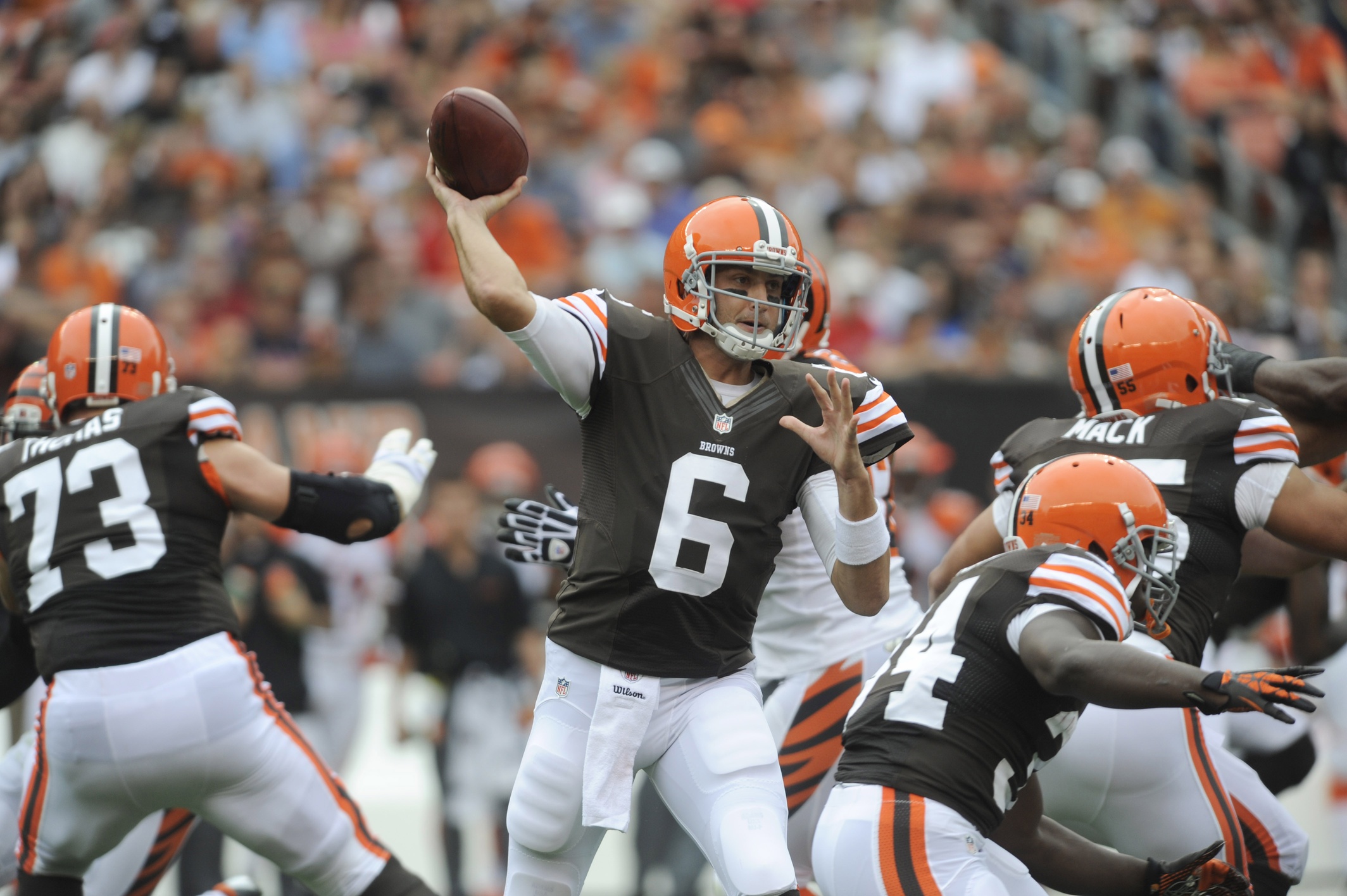
Looks, it’s a cinch that football fans are not Cleveland Browns fans because of the uniforms. The Browns’ orange, brown and white scheme is only slightly less underwhelming than their cellar-dwelling on-field performances. The only disappointment more consistent than these duds is the Browns’ need for a quarterback.
That dynamic led to a highly anticipated and widely marketed rebranding initiative. The campaign took two years to complete, and the Browns recently unveiled their new logo to replace the iconic but somewhat tired orange helmet … the new result? Wait for it (the fans did for two years) … another orange helmet. Essentially, the team went from orange peel orange to traffic cone orange. That’s pretty much it.
Well, according to some wits on social media they also gave “The Dawg” rabies. Not an unfair commentary by any means. And the rest of the PR fallout from this decision? Incendiary. Even fans growing accustomed to disappointment seem to feel punked this time around.
Logic says, your reaction better be as big as your promotion. When you make legions of some of the most loyal fans in the history of sports wait for two years to experience hope in the form of a brand transformation and you come up with … not much transformation at all … it comes off as not trying. As taking them for granted. As … not putting enough care into putting out a winning product.
That’s not to say every logo is a winner. When the Tampa Bay Buccaneers debuted in the late 1970s, they came with an orange popsicle color combination and a flamboyant Errol-Flynn-Mustachioed pirate (of Penzance). Fans grew to hate the logo as much as they did the on-field (lack of) performance. So the Bucs went back to the drawing board, coming up with the iconic new color scheme and pirate logo. Then they put a winning team on the field and their fan base grew by massive numbers, everyone sporting the cool new gear. The creamsicle days are saved for irony and throwback games.
The Browns had the same chance. Judging by their fans’ reactions, they blew it … again.
Read more from Ronn Torossian:
Ronn Torossian on Forbes
Ronn Torossian on SoundCloud
Ronn Torossian on LinkedIn
Ronn Torossian’s Professional Profile on Muck Rack
Ronn Torossian on Business Insider
Looks, it’s a cinch that football fans are not Cleveland Browns fans because of the uniforms. The Browns’ orange, brown and white scheme is only slightly less underwhelming than their cellar-dwelling on-field performances. The only disappointment more consistent than these duds is the Browns’ need for a quarterback. That dynamic led to a highly anticipated and widely marketed rebranding initiative. The campaign took two years to complete, and the Browns recently unveiled their new logo to replace the iconic but somewhat tired orange helmet … the new result? Wait for it (the fans did for two years) … another orange helmet. Essentially, the team went from orange peel orange to traffic cone orange. That’s pretty much it. Well, according to…